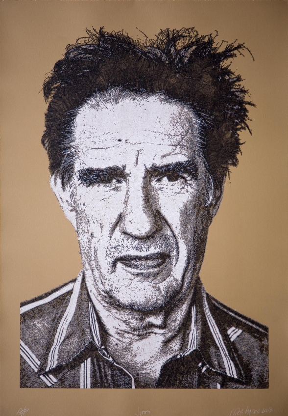
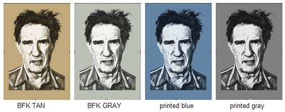
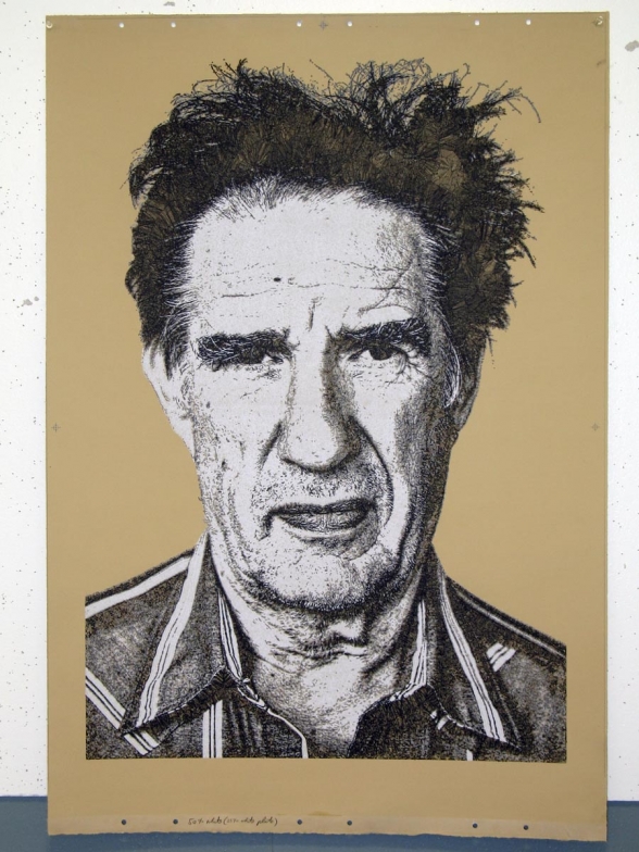
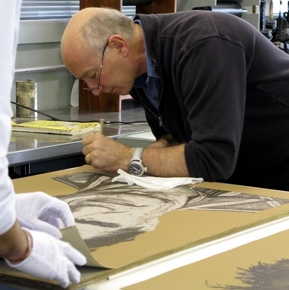
“Jim“, 2008, 43.25 x 30 inches, lithograph from seven plates on BFK Tan paper is available for $1,800 from Lawrence Lithography Workshop edition of 26.
Collections: Nelson Atkins Museum of Art, Springfield Museum of Art, Beach Museum of Art, The Collectors Fund, Consumer Growth Partners
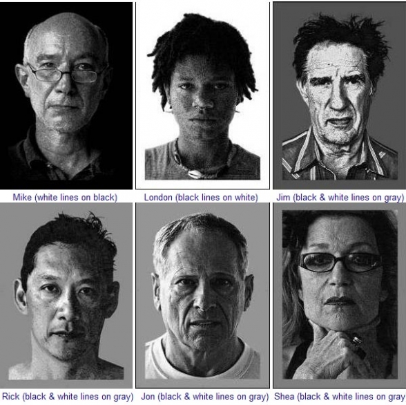
At the opening of the Kemper Museum “Backstage Pass” show last month, master printer Mike Sims of Lawrence Lithography Workshop invited me to design some images for him to publish. I made half a dozen designs for him and he selected “Jim”, a litho using six plates, three of various transparency white inks and three of various transparency black inks on mid-value paper.
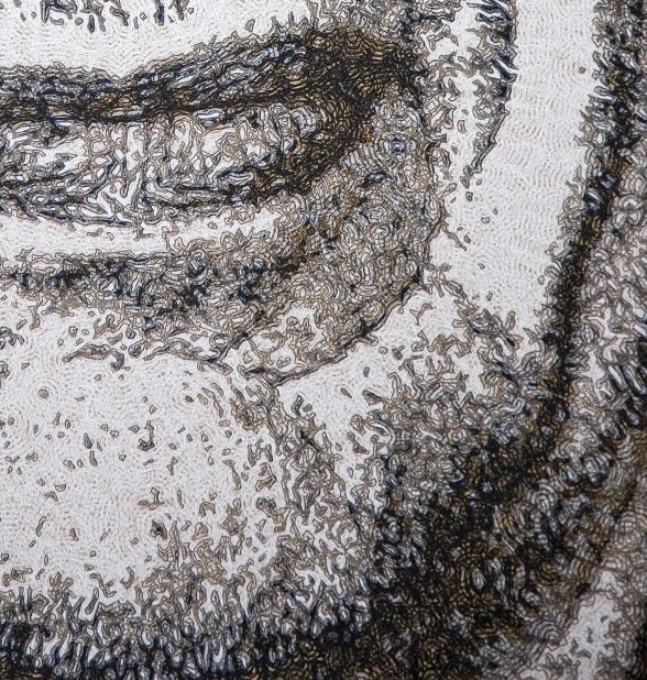
I experimented with a number of possible paper colors and decided the Tan was most appropriate for the image, although likely too light — but I really wanted the paper (not ink) to establish the mid-values as it peeks through all the tiny spaces between lines and through the transparent inks used in four of the plates.
In order to create the mockups I actually created program files as though I were going to make these drawings on my CNC machine. Then I spent a few days writing a new program to convert my drawings into AutoCad DXF files which I loaded into Adobe Illustrator. This was VERY cool (to me) as it allowed me to experiment with various line thicknesses and transparencies and paper colors in order to optimize the films for the plates by ‘seeing’ accurate previews of the finished print before any plates had been burned or proofed.
I’d originally imagined we could ‘dye’ white paper a nice mid-gray using sumi or other water-based pigment — my thought here was to print lighter and darker inks so that the paper color becomes the mid-range of the image, the image being produced from cross hatched squiggley lines similar to my recent drawings.
I tested my paper-coloring idea and abandoned it as beyond me. LLW suggested printing the entire sheet gray, but that was unappealing to me… It’s important to me to maintain the ‘paper’ quality of the paper. So I tested the design, trying out various available papers and decided on Rives BFK Tan which is dark enough for the image and adds a very appropriate color.
In order to accomplish the drawings for the plates, I wrote some (very cool) code to prepare my squiggly lines for a local pre-press shop to produce films from which Mike Sims and the Lawrence Lithography Workshop folk could make the litho plates.
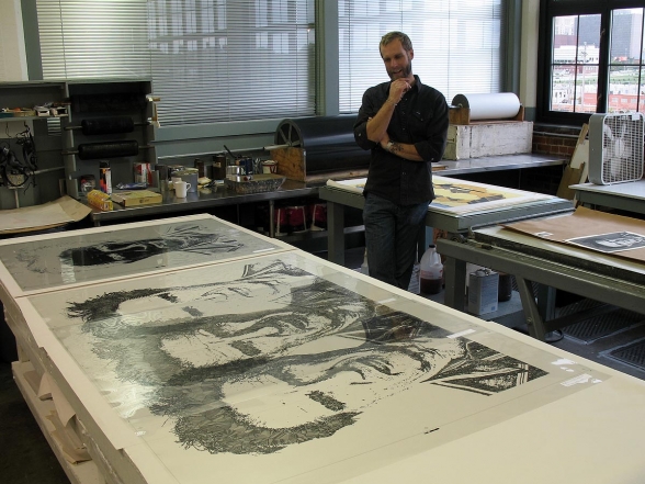
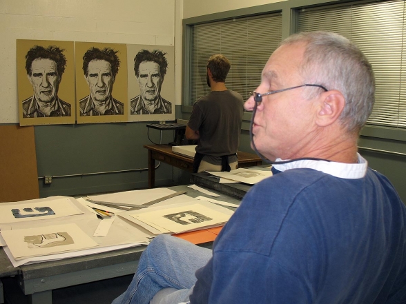
The films for the six plates arrived today and they are pretty spectacular, actually! WOW! I’m SO excited and happy to see these — and very satisfied to have more or less precipitated my ideas into ‘reality’ so directly and effortlessly! Here’s a photo showing Aaron Shipps (Tamarind Institute master printer and Mike Sims’ assistant) with some of the large film positives from which they’ll make the plates.
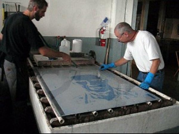
Plates were burned from the films yesterday (10-17-2007) and they turned out GREAT! Totally amazing to me what perfectly clear sharp lines appeared when the plates were developed. This is going to be a very successful print, I think, and the scale is terrific. VERY exciting, and very gratifying that Lawrence Lithography is investing such an enormous amount of time and money in publishing my work!
Printing should begin on Monday!
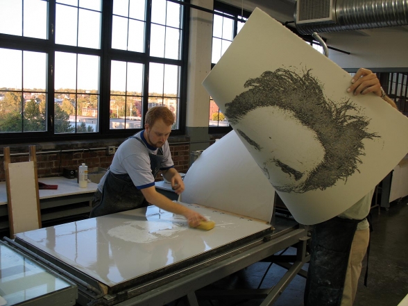
October 25-26, 2007 — first proofs of “Jim”
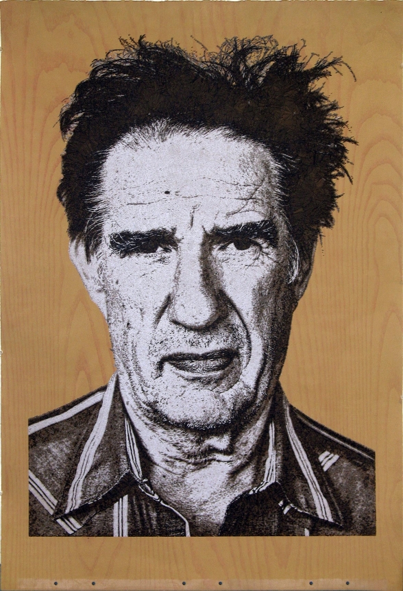
The BFK paper has turned out to be too light in value to provide the mid-values the image requires. We’re considering various measures to darken the paper… Tea-staining the BFK Tan to make the paper darker overall, printing a flat over the entire sheet, printing a 7th plate in a mid-value under the image (I’ve produced an image for film to accomplish that, but that method is pretty far afield from my ‘pure’ concept of lightening and darkening the paper through cross-hatched squiggles, so I’d much prefer either finding or producing a darker paper than under-printing the 7th plate…
The proof above might be the direction we follow for the print. In this one, a silhouette in dark brown was printed on top of the mokuhanga style woodgrain printing, then the six blocks in whites and blacks was printed on top. Today, I’ll run over to LLW to print four more sheets in a similar fashion, but a bit darker, and we’ll try to eliminate the silhouette plate. The middle black in the print above was TOO transparent, I think, and didn’t pop properly, so we’ll try to fix that as well. Lots of work ahead before it’s ready for editioning!
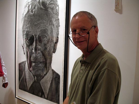
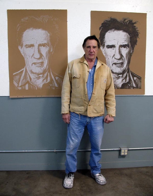
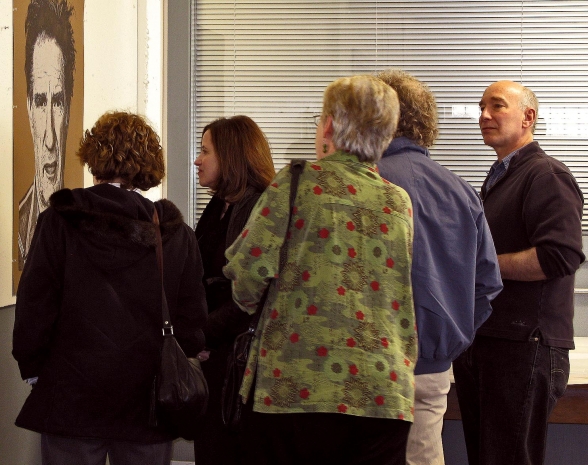
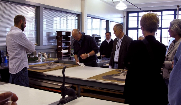
Photos from the ‘print signing’ party April 13, 2008:
