In the beginning…
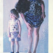
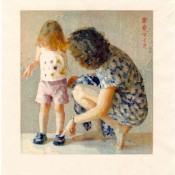
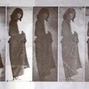
I was born June 18, 1951 to Joanne Redak Lyon, then 20 and Lee Ripley Lyon, then 27. My father was an amateur photographer who worked with my grandfather in the family cattle hide processing business. My mother had been a student at Mills College prior to marriage, and by the time I was three or four years old she enrolled in the Kansas City Art Institute where she became a painting student of Wilbur Niewald. She worked on many of her art assignments at home. My early exposure to the paintings, drawings, sculpture, prints, and photography of my parents and their consistent praise of my own artwork were probably the reasons I’ve always wanted to be an artist.
Education
 I received two degrees in art, a B.A. in Architecture and Fine Art (sculpture) from the University of Pennsylvania in 1973 and a B.F.A. in painting from the Kansas City Art Institute in 1975. Influential instructors were Frederic Osborne (sculpture), Frank Kawasaki (drawing), Michael Eisenman (printmaking), Rackstraw Downes (drawing), Neil Welliver (color theory), Stanley Lewis (drawing), and Wilbur Niewald (painting). The work I did in college were attempts to understand and conform to whatever I was taught – primarily ‘visual’ drawing and painting from life. I really had no other direction.
I have been interested in things Japanese and Zen since childhood. My first visit to Japan was in 1991 on a two week tour organized by Tsutomu Ohshima and Shotokan Karate of America which culminated in an exhibition at Waseda University in Tokyo to honor the 60th Anniversary of the Waseda karate club. I began to practice Japanese woodblock printmaking in 1996 and attended a two-week intensive workshop later that year under Hiroki Morinoue at Anderson Ranch Arts Center in Colorado. Two years later I was able to practice under Hiroki for three weeks in another Anderson Ranch workshop. I eventually taught the techniques there and at the Center for Contemporary Printmaking in Norwalk, CT where I presented my own one-week intensive workshops.
Business
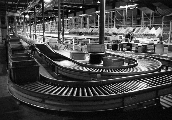
Soon after graduating from the Art Institute we were living well below poverty and I realized that I was unable to make enough money making art to support us. With the ‘encouragement’ of my family I joined my father in the family business. In 1978 I founded the computer hardware and software design company, Grading Systems, probably best remembered for developing Robo-Pic, an award-winning split-case order filling system installed at Tupperware, Discovery Toys, and other big ‘party-plan’ operations around the country.
In 1979 I purchased the hide business from my father. Eventually, I felt I’d saved enough money to return to making art. I sold the businesses and in 1992 resumed making paintings, prints and other artwork full time.
Technical development 1992 to present
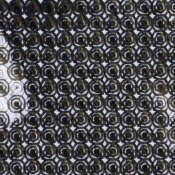
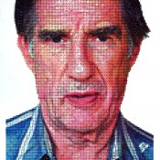
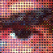
In the 1990’s I began to explore (and continue today) ways image might be communicated through repetitive gesture.
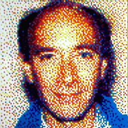
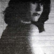
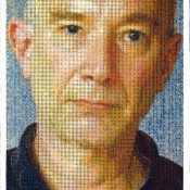
Early experiments were compositions of square ‘tiles’, colored and arranged in grids so that some image (often a portrait) was communicated. Initially I composed and displayed these on the monitor of my computer, as very large pixels which I then painted from life as if the image on the monitor was a still life. I became interested in finding a threshold of fewest colors and pixels or tiles which still communicated meaningful image. (4 x 4 foot self portrait, 1995, seven-colors brushed straight from the tubes in 9,216 half-inch squares).
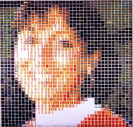
In order to speed the image-making process, I machined several thousand half-inch cubes so that each face of each cube had a different fraction of its surface removed. I would arrange these in grids, ink them, and pull a relief print. Then I’d clean the blocks, rearrange them, ink them again and overprint. This activity was very engaging (portrait of my sister “Pat”, 1994, four over-printings of 1,600 cubes arranged in a 40 x 40 grid).
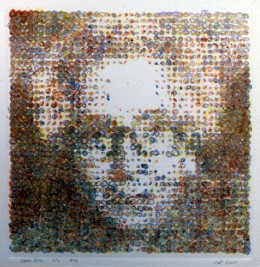
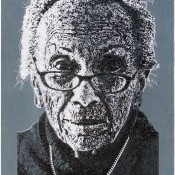
After a few years spent experimenting with such ‘tiled’ paintings and prints (“Nana Rita”, 1993, monotype in three oil-stick colors), I became more interested in the arrangements and patterns of the tile-parts themselves and produced tens of thousands of very simple and non-representational tile patterns. In order to reduce the number of patterns for consideration, I began to limit my exploration to symmetrical arrangements of a small number of identical tiles. I was surprised to find that in viewing different symmetrical arrangements of identical tiles I was strongly attracted to some of the patterns and repelled by others. I was fascinated by my inability to explain exactly why those patterns ‘felt’ so different when they were built from identical parts. I believe that I’d discovered a very minimal structure in which aesthetics seemed paramount and delicious.
I began to consider aesthetics and attempted to move toward ‘beauty’ in my work.
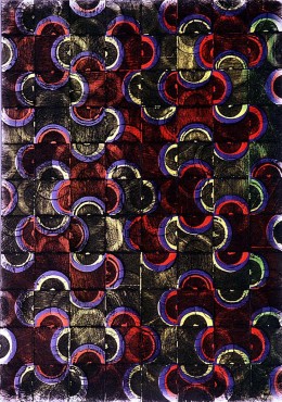
The tile patterns I’d been producing were entirely rational and I could understand them easily ‘all at once’. When I overlaid two or more such patterns in a single image, though, the result was surprising and although I could easily understand the process which produced the image I could not easily understand the image itself. (“Red Lion”, 1997, woodcut, water based pigments from movable-type block set with semi-circles carved away). This was challenging and I began to feel that I’d discovered a minimal border between ‘science’ and ‘art’. When I could understand it ‘all at once’, that was ‘science’ and when I could not, that was ‘art.’ The fact is that I am able to completely understand only the simplest arrangements – when an image was even slightly more complex (by layering several simplest arrangements) I could no longer genuinely understand at all – I could only feel that I liked or didn’t like it – pure aesthetics!
Contours and Layers
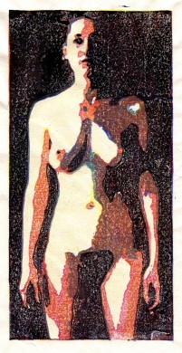
I became increasingly fascinated with ‘LAYERING’ – the surprising, interesting, difficult to comprehend way even the simplest arrangements became complex beyond understanding when they were ‘layered’ one upon another. I continued to build images using sets of simple ‘movable type’ tiles set into grids through 1999. Concurrently from spring of 1996, I experimented with more complex contour shapes in an effort to produce more naturalistic representational work – primarily nude figures and portraits (“Sarah”, March 1996, four-block woodcut). In June, 1996 I was introduced to Japanese technique woodblock printmaking during a two week workshop taught by Hiroki Morinoue (and I studied the technique under him for three intense weeks several years later).
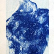
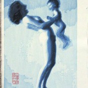
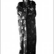
I loved the balance of conscious and unconscious required for Japanese woodblock printing and began increasingly to concentrate on reduction woodblock prints beginning in 2002, with Robe which was printed entirely in shades of Prussian Blue, and then Music which added black (sumi) to the darker layers of the image, then a first attempt at realizing color in Blue Shoes in which I reduced three blocks in register, one each in reds, blues, and grays and finally Lily and Sarah in which four blocks were each reduced in eight steps to achieve something akin to ‘full’ color (32 color layers in the print).
- “Blue Robe” 2002, 14.5 x 7 inches, woodcut on gampi
- “Music” May 2002, 10.5 x 7.5 inches, woodcut on Yamaguchi hosho
- “Blue Shoes” Aug 2002, 15 x 10 inches, woodcut (23 reductions of 3 blocks) on Yamaguchi hosho (50 sheets)
- “Lily & Sarah”, 2004, 9 x 8 inches, woodcut from 32 cherry blocks, iwano Ichibei hosho, 48 sheets
Carving by Machine
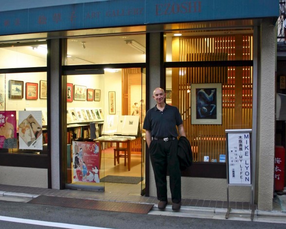
While traveling in Japan in spring of 2003, I met Go Yamao, director of Gallery Ezoshi in Kyoto. Yamao-san asked me what I did for a living and I told him I made moku-hanga (woodblock prints). I showed him several images of my work on-line and he couldn’t believe they were woodcuts. The following day, I brought some of my work to his gallery and he bought two prints and offered me a solo show during the fall of 2004.
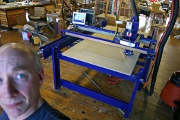
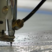
Once home, I began producing prints for the show in earnest. I kept wishing I could work larger, but my body wasn’t cooperating at all! I’d long dreamed of building a computer controlled machine to draw and paint under program control — but this was no time for a long development… I located a ready-made computer controlled router in kit form which I could afford. It took several weeks to put it together and begin to experiment. The first blocks I produced using the machine printed very well!
The machine allowed me to carve much larger blocks — up to eight feet in lengh. But it was not at all obvious to me how to handle the very thin, damp, handmade Japanese papers when they were larger than about 15 x 20 inches (the largest I could manage the ‘traditional’ way. A couple of assistants ‘could’ help me register larger sheets, but I really wanted to work alone.
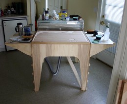
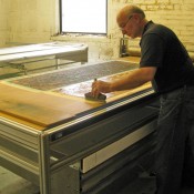
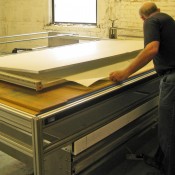
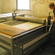
Eventually I designed and built a special table equipped with vacuum plenum to hold the blocks flat and still during printing and with a special humidor which would keep the paper damp and a drawer to deliver and support the paper directly over the block and out of the ink during registration, then as the drawer was closed, lay it out smoothly onto the block. A foot pedal and counter-weight controlled the opening and closing of the drawer and I successfully produced 30 x 20 inch prints with excellent registration from fifteen or more blocks
In April 2004 the first 30 x 20 inch woodcut editions pulled using the new table and what I began to call the ‘humidrawer’ was “Anthony” completed April 29, 2004 from 15 blocks (winner of the 2005 McNeese National Works on Paper competition). “Anthony” was followed by “Sarah” on May 15, 2004 from 19 blocks and “Rod” on August 5, 2004 from 16 blocks a few months later.
- “Anthony” 2004, 30 x 21 inches, woodcut (collection: McNeese State University)
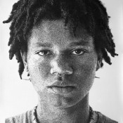
- “Sarah” 2004, 21 x 30 inches, woodcut
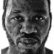
- “Rod” 2004, 30 x 21 inches, woodcut
Machine-assisted Drawing, Intaglio, Painting
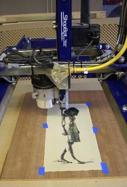
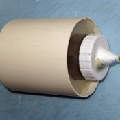
After working with the CNC machine and my portable printing table and humidrawer for seven months while completing the woodcut editions for my October 2004 exhibition at Ezoshi Gallery in Kyoto, Japan, it occurred to me that the same processes I used to carve blocks on the big CNC machine could be adapted to make drawings, paintings, mezzotints, and drypoints, an idea which had been floating around in my mind for many years. The first image I attempted was a small pen and ink drawing of Jessica with the pen mounted in a jig I’d built adjacent to the router in my CNC machine. The drawing was built in layers of ‘tone’ using a method very similar to clearing blocks – the clearing tool path drawn with pen instead of routed. Each tonal layer was drawn right on top of the previous and an unusual kind of crosshatching developed which I found interesting. Later I revised my early pen jig shown in the photo at left below so that the pen could be centered in the router clamp. I used a short length of PVC pipe (the same diameter as my router), filled it with compressible closed cell foam with the center notched to accept a pen – this ‘soft’ pen mount allowed much more accurate control over the pen and I eliminated the broken pen nibs which plagued my early experimental drawings.
I used a similar approach to mezzotint images into copper plate for intaglio printing. Mezzotint is a technique in which the entire plate is roughened (traditionally using a curved tool with many sharp teeth which is rocked by hand over the plate). Such a plate when inked, wiped, and printed in an intaglio press produces a dense black all over. The lighter tones are developed out of the black by smoothing the pits and burrs created during rocking by scraping and burnishing. Very subtle and rich continuous tone from black to white can be produced from plates processed this way.
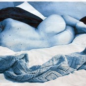
The mezzotints I made didn’t use a rocker. The technique I developed used roulettes and drypoint needles to dig pits and raise a burr on the surface of the copper plate. For example, in the “Sarah Reclining” mezzotint, the black ground was first created by drawing a very fine drypoint needle over the plate in about 100 rasters per inch. Once I’d covered the plate with such parallel lines in one direction, I repeated with the rasters rotated about 15 degrees each pass until I’d overlapped the lines through 180 degrees. Then I began to develop the light tones by ‘drawing’ them with a tiny ball-end burnishing tool. I first drew the lightest areas (as if drawing or clearing with a very tiny router bit), then the next-to-the-lightest areas, overdrawing the lightest areas, etc. until I’d drawn the darkest non-black area plus all the other tones except black. I used the CNC machine to perform all the tool movements (calculating the paths in advance) and mounted the roulettes, drypoint needles, and tiny ball-end burnishers into the machine using special jigs I built for each tool. Then I moved the tools in the machine under program control for many hours. The 12 x 18 inch “Mia” plate (below), for example, required almost three weeks of 24 hour a day burnishing to complete.
- “Sarah”, 2005, mezzotint proof
- Feb 20, 2005 mezzotint (drypoint and burnishing using CNC)
I took a completely different approach to painting, writing my own programs to control the height of a brush, pushing it down into the surface to produce a fatter line and raising it to produce a thinner line, similar to the way tone is produced by engraving, I suppose. So far, these experiments with brushes have produced less interesting objects than the drawings and woodcuts. I haven’t shown them but I haven’t given up either, as the method fascinates me.
- untitled, Nov 2004, first paintings, watercolors on okawara scroll
- CNC jig with drilled watercolor brush mounted in ketchup bottle
- Nov 24, 2004 detail of painting using diagonal brush path
- Nov 25, 2004 detail vertical and horizontal brush paths
- “Jerry” Jan 2005, painting (brush and ink) diagonal spiral grid (weighted spirals)
- detail of brushed ink spirals
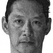
- “Jim” March 2007, 43 x 27 inches, airbrush painting, gestures in grid
- detail of 2007 “Jim” airbrush
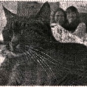
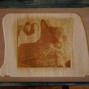
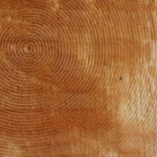
I tried a technique similar to the one developed for painting in a woodcut, substituting a V-bit in a router for the paint brush in order to produce tone by varying the width of a carved spiral line. I thoroughly enjoyed writing the complex programs to generate the zillions of lines of tool path instructions which produced the very subtle up and down movement of the tool as it spiraled relentlessly out from the center of the cat’s eye.
- “Cat and girls” Jan 2005, woodcut from three spiral cut blocks
- one of the blocks for “Cat with girls”
- detail of spiral cut centered on cat’s eye
Larger Scale
During 2005 I began to design and construct a press and scaled up and improved humidrawer. These were completed early in 2006 and allowed me to print tightly registered woodcuts from many blocks in sizes up to 4 x 8 feet.
- dampening block
- registering paper
- printing
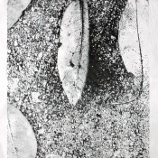
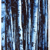
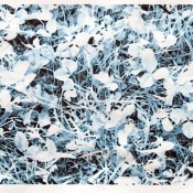
Between February and August I completed three woodblock print editions on 42 x 77 inch Iwano Ichibei paper, “Leaves” an eight step reduction “Aspen Grove” a 12 step reduction, and “Sara Reclining” from 17 separate blocks.
- “Leaves” 2006, 77 x 42 inches, woodcut from 8 blocks on Iwano Ichibei hosho
- “Aspen Grove” 2006, 77 x 42 inches, woodcut from 11 blocks on Iwano Ichibei hosho
- “Sara” 2006, 42 x 77 inches, woodcut from 17 blocks (collection of Beach Museum)
- “Grass-2”, 2010, 22.5 x 72 inches, woodcut from 16 blocks (8 sheets printed)
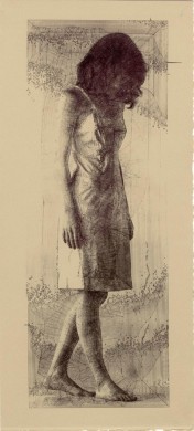
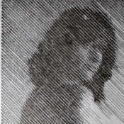
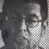
During 2006 I began to make life size figure drawings and other large scale drawings. These drawings explored a method of producing continuous tone by cross-hatching. The cross hatching was the product of overlaying between fourteen and 24 layers, each of which was filled with concentric contours designed so that no lines in a layer ever crossed. The layers were drawn in black ink on Arches 300 lb. hot press watercolor paper (strong enough to withstand such intense drawing and redrawing) using an extra-fine pen mounted into my CNC machine and moved in accord with instructions generated to follow the concentric contours which filled each tonal layer. As the layers were drawn one on top of the other, an unusual and unpredictable wacky sort of cross hatching developed automatically.
- “Sarah” 2006, 84 x 45 inches, drawing in ink (permanent collection, Kemper Museum of Contemporary Art)
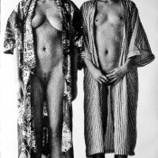
- “Shannon and Danielle” 2006, 90 x 45 inches, drawing in ink on paper (Humbert Balsan collection, New York)
- “Jon” 2006, drawing in ink on paper (collection of Daum Museum of Contemporary Art)
- “London” 2006, 78 x 45 inches, drawing in ink on paper (Barkley collection)
During 2007, I concentrated mainly on large scale portrait heads in pen and ink, watercolor, and acrylic paints, and continued to advance my understanding of how to control color and value through the process of overlapping many layers of line. I also designed and built several solenoid-actuated devices for painting and drawing which I am able to control using my computer and CNC machine. These have significantly improved my ability to draw and paint ‘by machine’ and are a huge improvement over my previous methods – much more reliable and with much less wear and tear on the equipment.
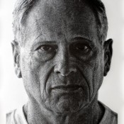
- “Anthony” 2007, 83 x 45 inches, drawing in ink on paper (Inergy, LP collection)
- “Rick” 2007, 75 x 45 inches, drawing in ink on paper
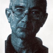
- self 2007, 59 x 32 inches, Painting in acrylics on Rives BFK
- self 2007, 43 x 27 inches, painting in acrylics on paper
The image on the far right above was my first attempt at a sort of renaissance chiaroscuro chalk technique. It’s painted in many layers of blue-black and white acrylic paint on paper, the white overlaying the black and vice versa.
- self 2007, 60 x 40 inches, painting, acrylic on linen
- detail of white acrylic paint on black ground
- “Linda” 2007, 75 x 45 inches, painting (airbrushed acrylic) on unprimed canvas
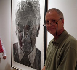
Mike Sims of Lawrence Lithography Workshop at the Backstage Pass Show at Kemper Museum with “Arthur”
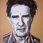
When Mike Sims, master lithographer at Lawrence Lithography Workshop invited me to collaborate with him on the production of a print edition, that’s the sort of technique I used to develop “Jim”, a litho from seven plates. Three of the plates are printed in various transparent whites and three in transparent blacks all printed over a mid-value brown from another ‘flat’ plate. The brown ‘background’ creates the mid-values as it peeks through the cross-hatched squiggles of the white and black inked plates. In order to accomplish this one, I wrote some fancy software to convert my machine instructions (as if I were going to draw the squiggles using my CNC machine) into standard file format which the pre-press outfit was able to feed directly into their film maker. Worked like a charm — the films were perfect, and so were the plates!
- “Jim” 2008, 43 x 30, 7-color lithograph on Rives BFK (collections of Springfield Museum of Art, Beach Museum of Art, The Collectors Fund)
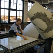
- Pulling first proof at Lawrence Lithography Workshop
- November 28, 2007 – Jim with some of the proofs at LLW
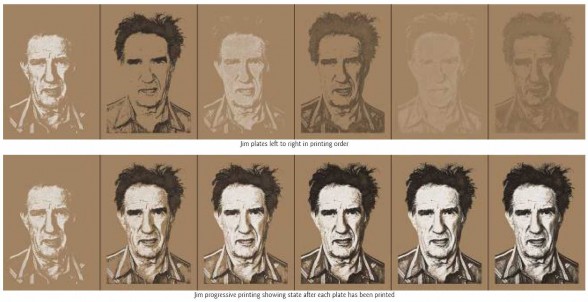
Jim plates on top left to rignt in printing order and below is progressive printing showing state after each plate has been printed
During November and December, 2007 I worked up some new pen and ink portraits, one of “Crosby” with a watercolor wash under the ink lines.
- “Crosby” 2007, 90 x 45 inches, watercolors and ink drawing (collection of Kemper Museum of Contemporary Art)
- blue painting completed and frisket removed
- over-drawing about 80% done (son Scott observes progress)
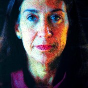
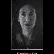
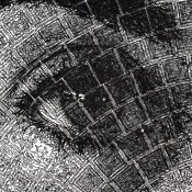
Late in July, 2008 I completed a 77 x 46 inch pen and ink drawing of my wife, “Linda”. This portrait marries my interest in ’tiling’ with my squiggly cross-hatched drawings. The drawing is constructed of hundreds of tiles, each roughly an inch square and arranged in a spiral originating at the tip of Linda’s nose. It was a huge challenge to figure this out and continues to provide me with lots of food for thought. The “Linda” drawing became the cover of the Beach Museum of Art’s exhibition catalog for my 2009 show there called “Figuring it out: Prints and Drawings by Mike Lyon”
- “Figuring it Out” exhibition catalog cover
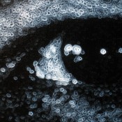
- detail of eye of “Linda”
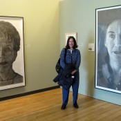
- Linda with “Annette” and “Linda” at Beach Museum exhibition, 2009
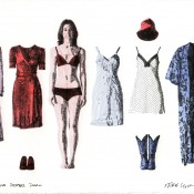
In connection with this exhibition, the Beach Museum commissioned me to produce an edition of small prints for sale to their patrons. Senior Curator, Bill North, and I had some interesting discussions about ‘what is a print’ in connection with this edition. Initially I’d intended to carve blocks and print each sheet in colors, then draw on top in register. In the end, I decided to draw in red, blue, and black inks to produce what is to my knowledge the very first fine-art edition of drawn drawings (or prints)…
- “Jessica Paper Doll” 2009, 10×15 inches, pen and ink on paper
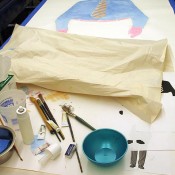
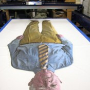
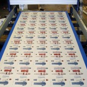
- 5×12 foot drawing completed and ready to tear out the 45 ‘prints’
In the broadest sense of the word, I think, the noun ‘print’ is synonymous with the noun ‘multiple.’ But, since the image was created on a single sheet of paper, roughly 5 x 12 feet, even the word ‘multiple’ is subject to question. BEFORE I tore the sheet apart, it was most definitely a pen and ink drawing. Once I’d torn the sheet into 45 pieces, each about 10×15 inches, it became an edition of ‘prints’ I think, even though each is an original drawing and no traditional printmaking process was employed.
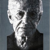
I continue to experiment with paint. In 2009 I experimented with the sort of light and dark over mid-value drawings which were popular in Europe 400 years ago. Although the medium is different (painting rather than lithography), my approach is very similar to the tack I took with my “Jim” lithograph — overlapping layers of line to communicate the value gradations of the image, but the paint makes these much more tactile and builds up a very heavy impasto as it overlaps and makes an interesting if somewhat bumpy surface — I LIKE these!
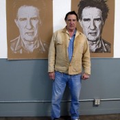
- “Lee” 2009, 35 x 21 inches, black and white acrylic paint on tinted paper
- “Joanne” 2009, 35×21 inches, acrylic on tinted paper’
- Detail showing “Joanne” painting underway using Paasche Flow pencil under computer control
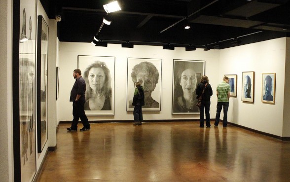
In March 2010 the Pool Art Center Gallery at Drury University mounted an exhibition of my recent work.
(always more to come…)
