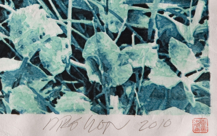
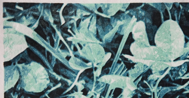
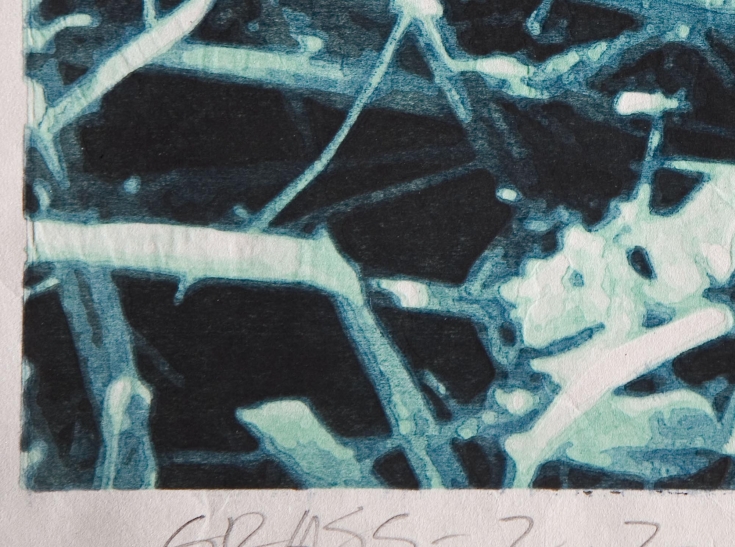
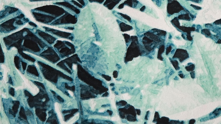
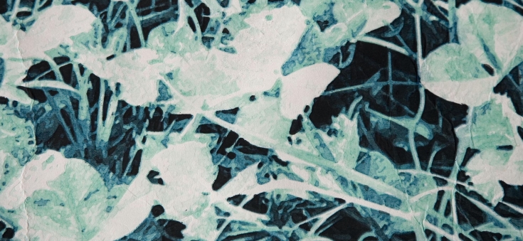
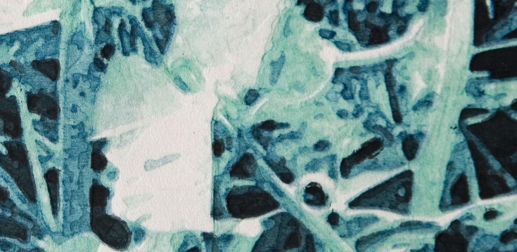
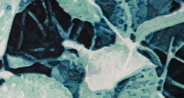
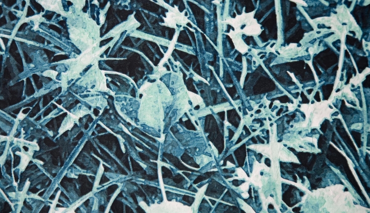
I ran a second edition of four sheets from the sixteen blocks used in Grass 2. I was curious to see the effect of transitioning from pale greens into blues into blacks (rather than the simple blues into blacks of the first edition). Also, I’d run into registration problems which affected five of the eight sheets I printed in the first edition — I thought I understood how that had occurred and wanted a test to be certain. The solution worked very well and was quite simple — use a baren to lightly fix each sheet to the block prior to impressing with the rollers.
The prints are very similar, but they feel different… The blue ones are a bit ‘crisper’ somehow and moodier. The green ones have a more liquid feel and seem a little less brooding. Both editions are quite good, I think — no matter where one looks, it’s interesting. I read a lovely book last week — and was struck by this passage:
“…a puddle from last night’s rain is evaporating; a puddle in which Magistrate Shiroyama observes the blurred reflections of gulls wheeling through spokes of sunlight. This world, he thinks, contains just one masterpiece, and that is itself.“
From “The thousand autumns of Jacob De Zoet”
by David Mitchell (Random House, 2010)

