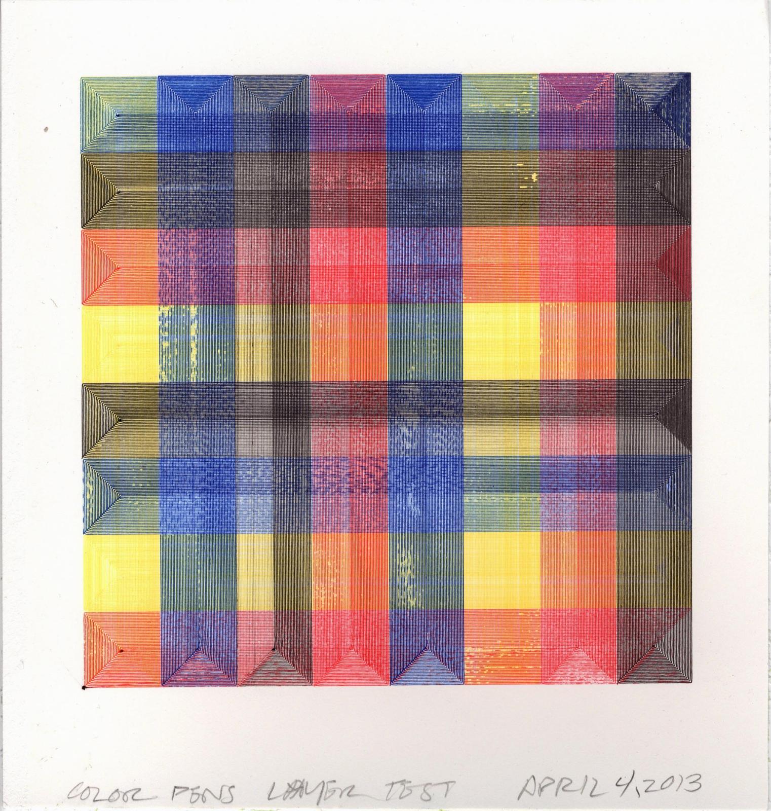
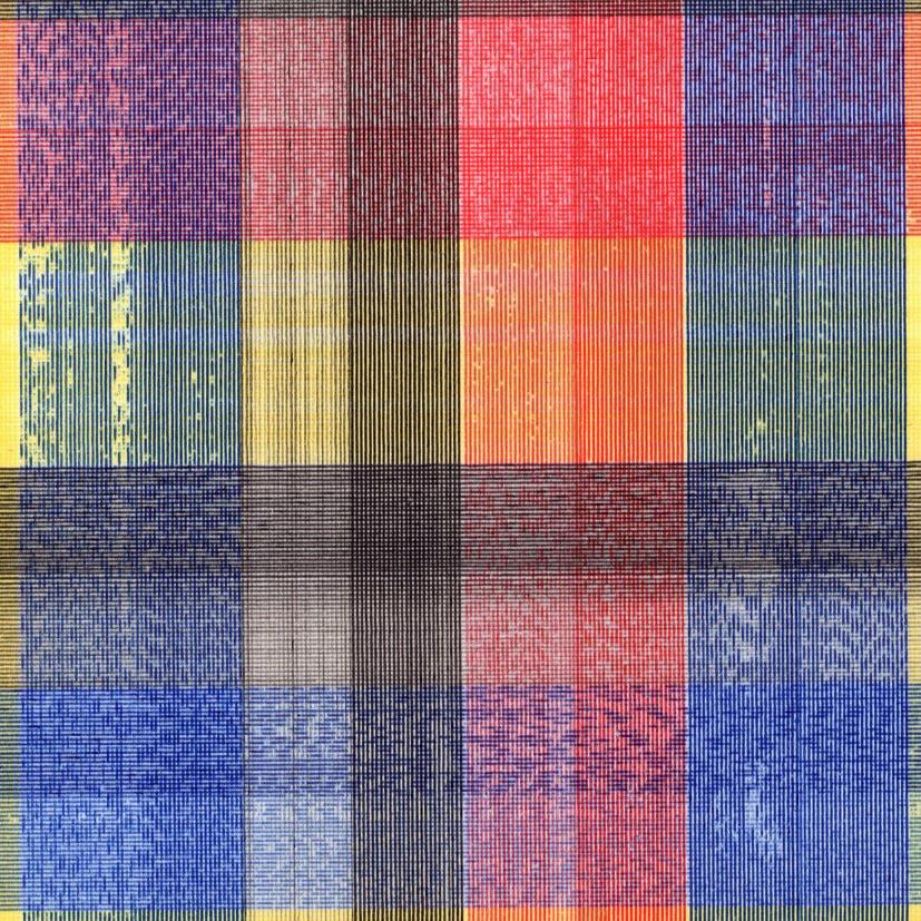
I wanted to try to realize something closer to naturalistic color. I’d tested a Japanese pen (Pilot Choose) with pigmented inks which, unlike most pens I’ve tested, would continue to write until the ink was gone. These were advertised as permanent with excellent light-fastness. I needed to learn how the colors blended when overdrawn, so I devised a simple (and attractive) grid test in which bands of each of four ink colors were laid down in a sort of weave so that every color was drawn on top of every other color. I hope that makes sense. The results helped me figure out a reasonably accurate way to separate color images into the particular inks I have available, in this instance, red, yellow, blue, black, and white (I’m only using white to reduce the value and saturation of colors, so I didn’t include white in my test). Here’s the test:
-
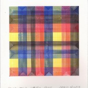
- “Color Test”, April 4, 2013, 6 x 10.6 x 10 inches, red, yellow, blue, black ink on paper
-
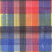
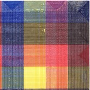
- detail of color test
-
- detail of color test

Interestingly, even though these pens are from the same product line, the inks don’t completely like one another, so there’s some interesting skipping which creates moire-like patterns somewhat randomly (click each of the images above to see those).
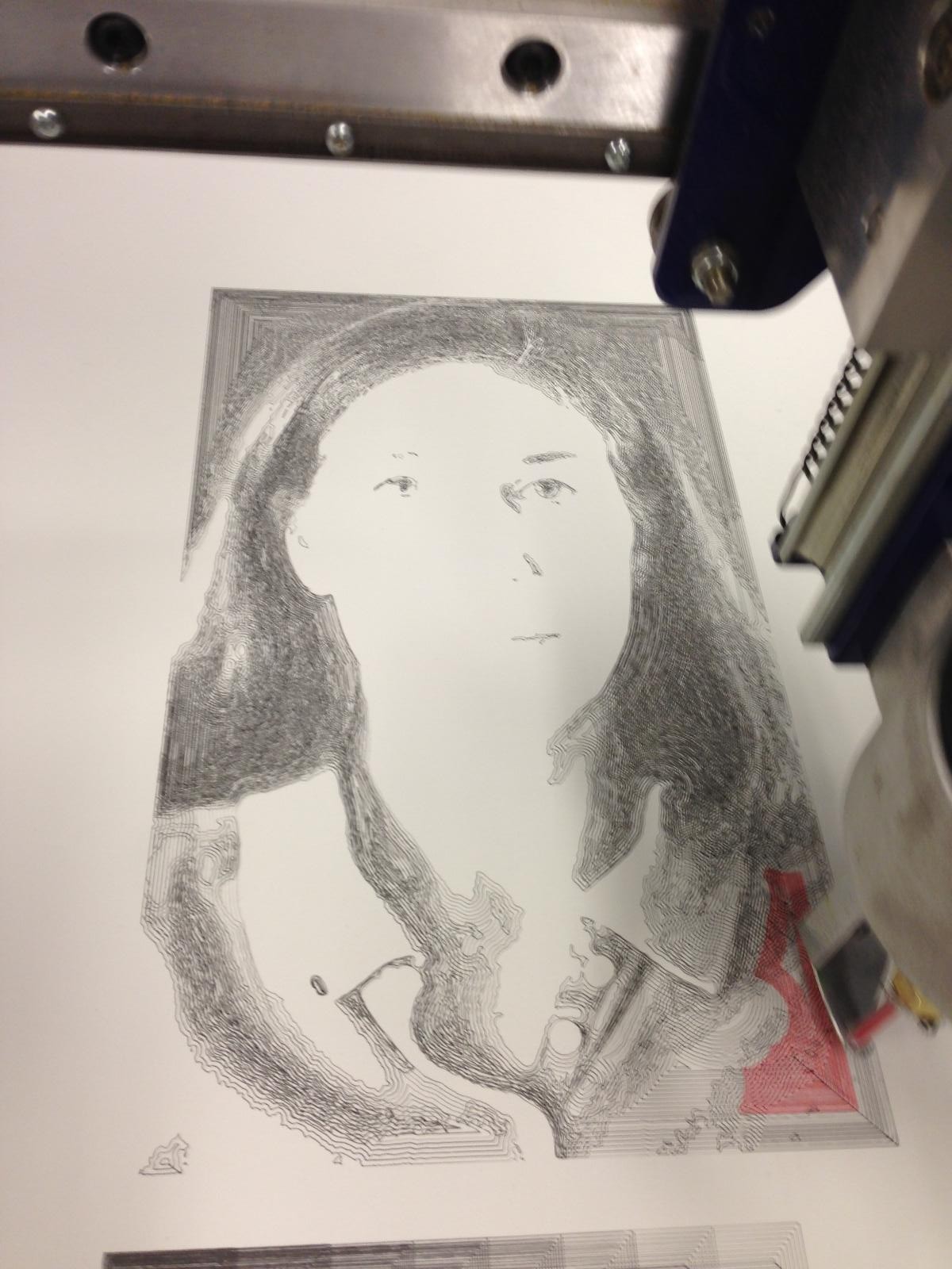
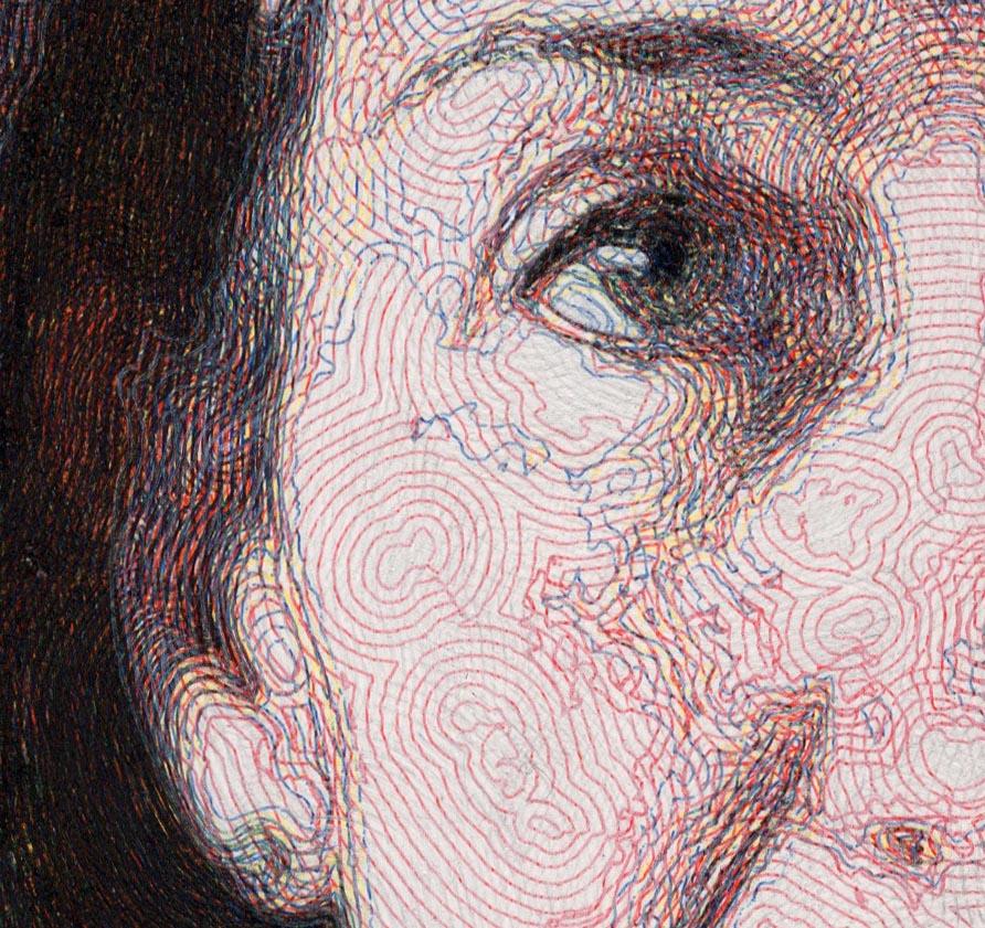
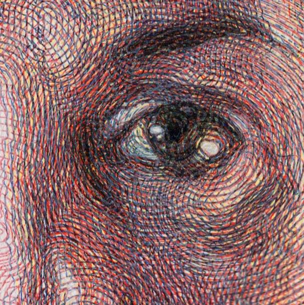
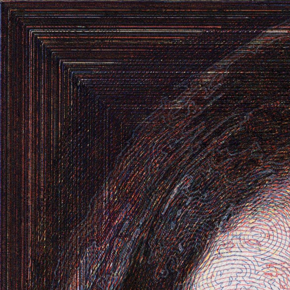
Once I felt I had the relative color strengths and transparencies figured out, I made a small bust portrait of my wife using the five colors.

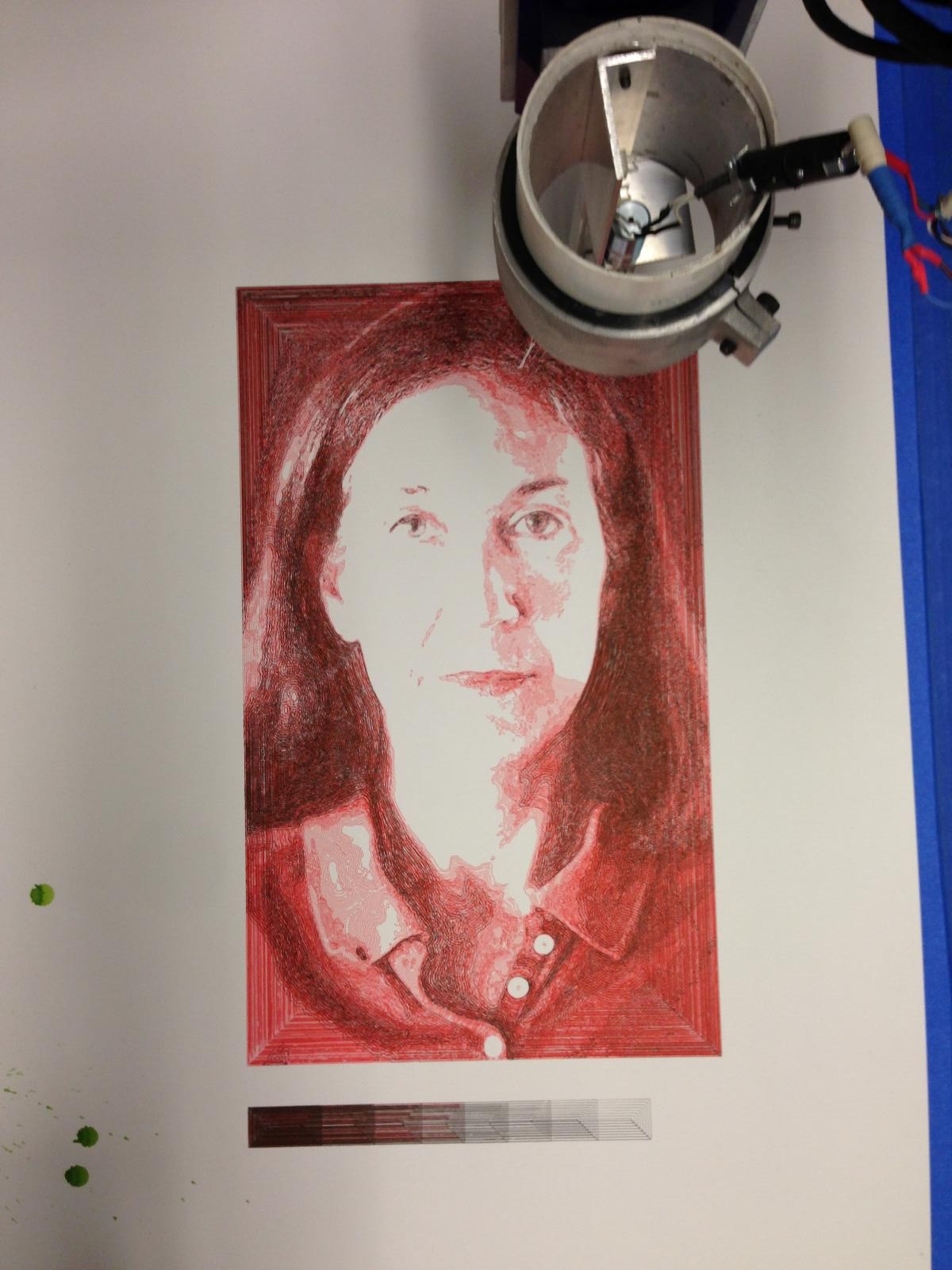
“Linda”, April 6, 2013, 25 x 16.5 inches, red, yellow, blue, black, and white ink on paper
Here are some details of the “Linda” drawing:
-

- black layers were drawn first
-
- red layers going down over black
-
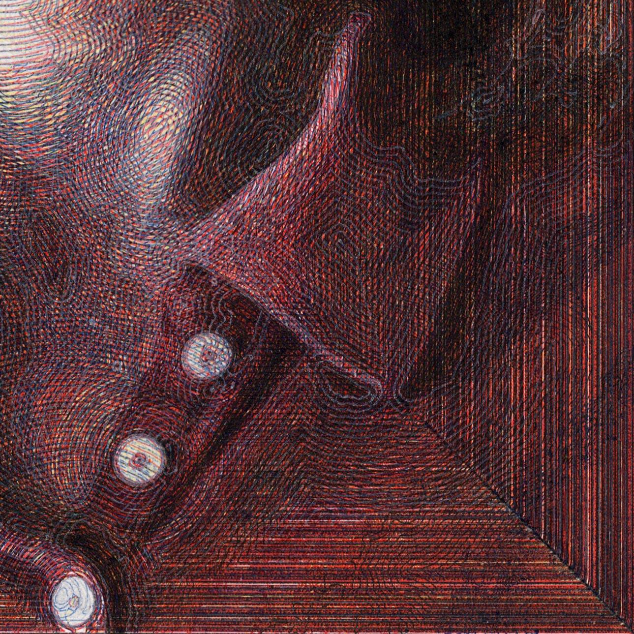
- Linda detail of light side
-
- Linda detail of dark side
-
- Linda detail of face

-
- Linda detail upper left
-
- Linda detail upper right

-
- Linda detail