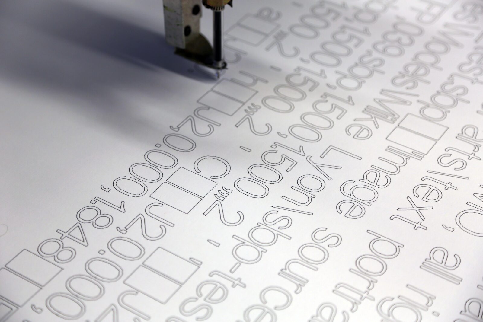
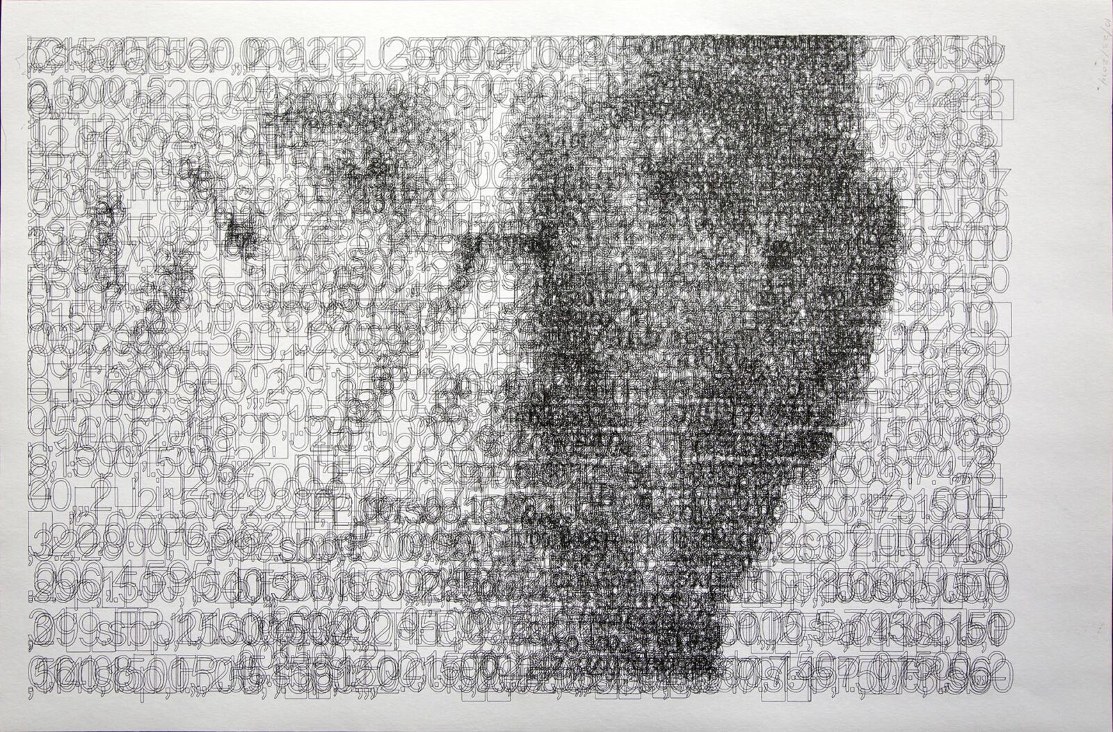
I spent a few months working out a kind of self-referential process I had in mind. The idea I had was to build images from text. The first step was to code general subroutines to draw text characters which could be scaled and drawn by CNC. I decided to code an outline typeface and I decided to make the character height be one inch with the top left corner at 0x and 0y. Here is a table of coordinates to draw a square character one inch high by one inch wide:
| Y=0 | Y=1 | |
| X=0 | 0,0 | 0,1 |
| X=1 | 1,0 | 1.1 |
So I laid out the list of coordinates to draw 96 characters – digits, upper and lowercase letters, and punctuation all with upper-left corner of the one-inch high ‘character space’ at 0,0 in order to make it simple to scale the coordinates by multiplying each coordinate by a scaling factor. Also easy, then, to position the character anywhere by adding offsets to the x and y coordinates.
I could draw rows of characters by incrementing the y-offset by the maximum scaled y-value of the character just drawn, plus some (scaled) constant for kerning. When the next character would cross the right margin of the drawing, I could reset the y-offset to the left margin and increment the x-offset by the scaling factor plus some scaled constant for line-height.
Now I could specify a reference-image file, set the dimensions of the drawing to be produced, set how many layers (passes) to produce, set a starting scaling factor and another factor to make the scaling grow or shrink after each pass, another factor for whether we’d be drawing in ink that’s lighter or darker than the color of the paper.
Now I’d get the next character to be drawn, scale it and locate it and then average the value (darkness/lightness) of all the pixels ‘under’ the area where the character would be drawn. If I’m drawing in dark ink, then if the average value of the image area is lighter than the value of the layer being drawn, I ‘move’ over by the width of the character and check again until the value is darker – then I draw the character, move over the width of the character again, and repeat.
After the modest trial above, I made a most wonderful drawing, an homage to Grant Wood’s “American Gothic” in the nude figures of my wife and me drawn in black and white ink on gray paper. Sadly, my wife won’t allow this work to be shown publicly – and THIS is a very public space, for sure!
My friend, the amazing sculptor David Miller, turned me on to ideas about the location of meaning. In most of my work, this has been communicated more like location of image, since the image truly does not exist outside the mind of the beholder – just a bunch of marks from which the eye and mind derive meaning. This is true of all perception, really, but seems ‘more true’ (is there such a thing as MORE true?) in the work I’ve been doing.

